Organisational Benchmark
The MyCake Benchmark enables you to compare your organisation’s financial results against one or more groups of similar organisations. We provide a series of key financial metrics with which to evaluate the financial health of your organisation and then benchmark this against one or more peer groups. The dashboards show a mix of single year results and five year trends. We also provide benchmarks of the grant income sources for these benchmark groups so that you can see where organisations of a similar shape and size have won funding.
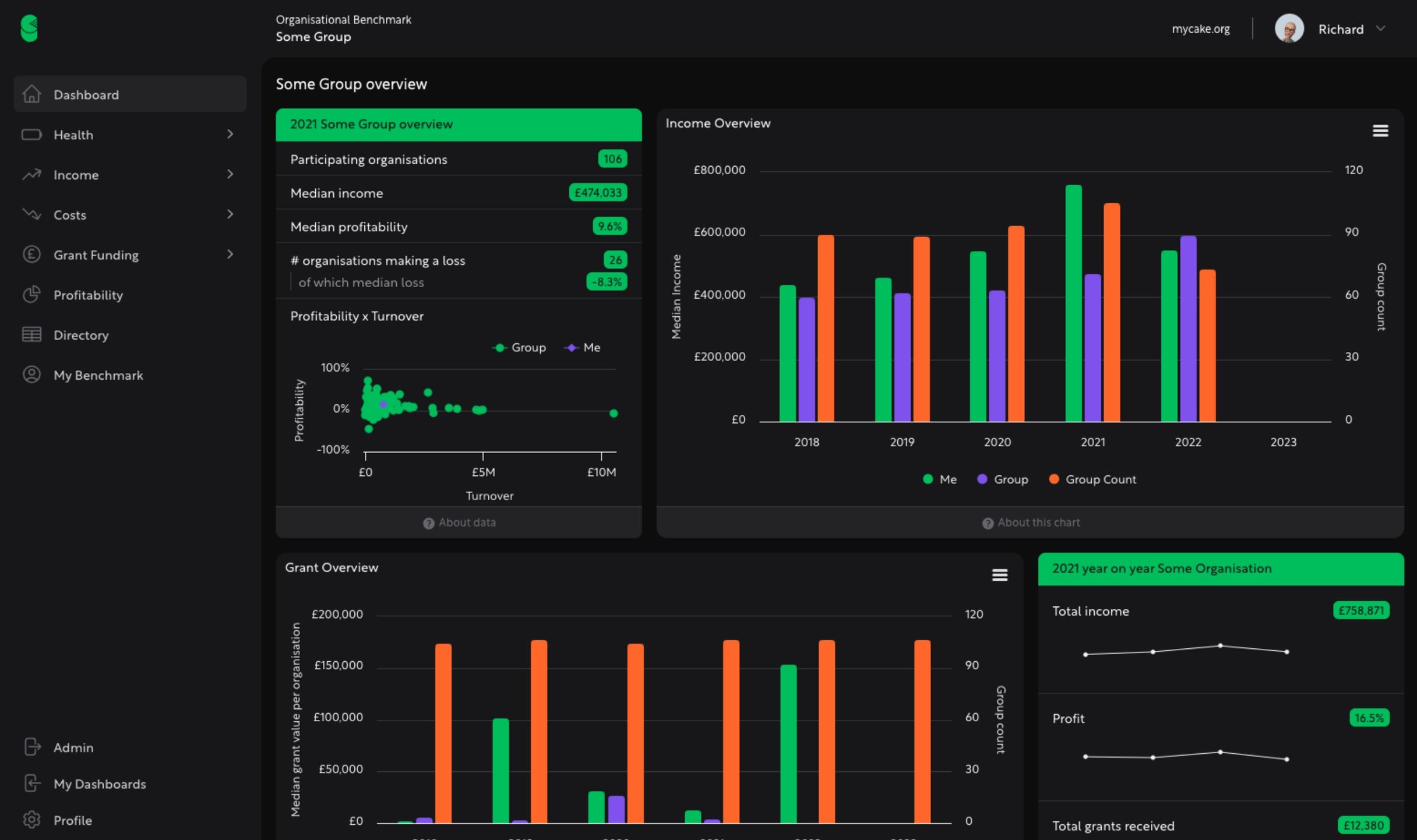
- Financial health key metrics —
- we have picked a small group of key metrics to describe financial health of your organisation and that of your peers. Comparison to the group is via the median for the group (of which you are a member of course!). We also show the number of organisations whose data is included in each median as this may change by year and by metric.
- Explore income —
- when we bring in data from pdfs of annual accounts we use the notes to accounts to split out the income into commercial & trading, grants, donations and other income. This allows you to benchmark your business model in more detail against your peers. Under each of these main headings are a series of further details so that you can compare the ratios of different grant sources or trading activities. This in turn helps you work out what ‘normal’ looks like for your peer group so that you can identify opportunities for your organisations’ growth or change.
- Explore costs —
- as with income we can allocate costs to a set of headings. This enables you to benchmark key areas of costs such as salary spend and direct costs. You are then in a better place to work out whether there are places in your business model where you are spending notably more or less than your peers and consider whether this generates advantages, risks or liabilities for your organisation.
- Explore grant funding —
- separately to analysing the contents of published sets of accounts we also draw in data from 360Giving. This means that you can see how the grants you receive from the Lottery and trusts and foundations compares to pattern of grants received by your peers over the last few years.
- Profitability —
- also known as surplus, this section looks at whether your income exceeds your expenditure and the patterns for your peer group over multiple years. This dashboard enables you to look at this key metric for the peer group and see how the group is spread by turnover and profitability across a set of profitability ranges.
- Participate in multiple groups —
- there may be a number of relevant groups for you to participate in – by sector, turnover, types of income and cost, geographic area, funder, programme etc. You can switch between groups so that you can see how the norms vary depending on the cohort.
- Directory of organisations —
- a list of all the organisations in the peer group with a few key stats on each. Downloadable for each year in the benchmark.
Frequently asked questions
Can't find the answer you're looking for? Please reach out with any questions.
- Can I use the data in the dashboard?
- Our goal is to make both the data and the charts as easy to copy and paste as possible. We’d object if you went and resold the data or copied it into another data platform without talking to us about the implications for you and for us but if you want to put it into reports and presentations we are here to help make that easy to do.
- How many members of my team can access the dashbaord?
- For now at least we’re not putting a limit on this nor is our pricing on a ‘per seat’ basis. So if you can tell us who needs access we’ll set it up for you. If the list becomes so long that it means we’re dedicating more time to supporting these users than any of us imagined at the start we’ll come back and talk to you about the implications for the price of the services.