Empowering Places
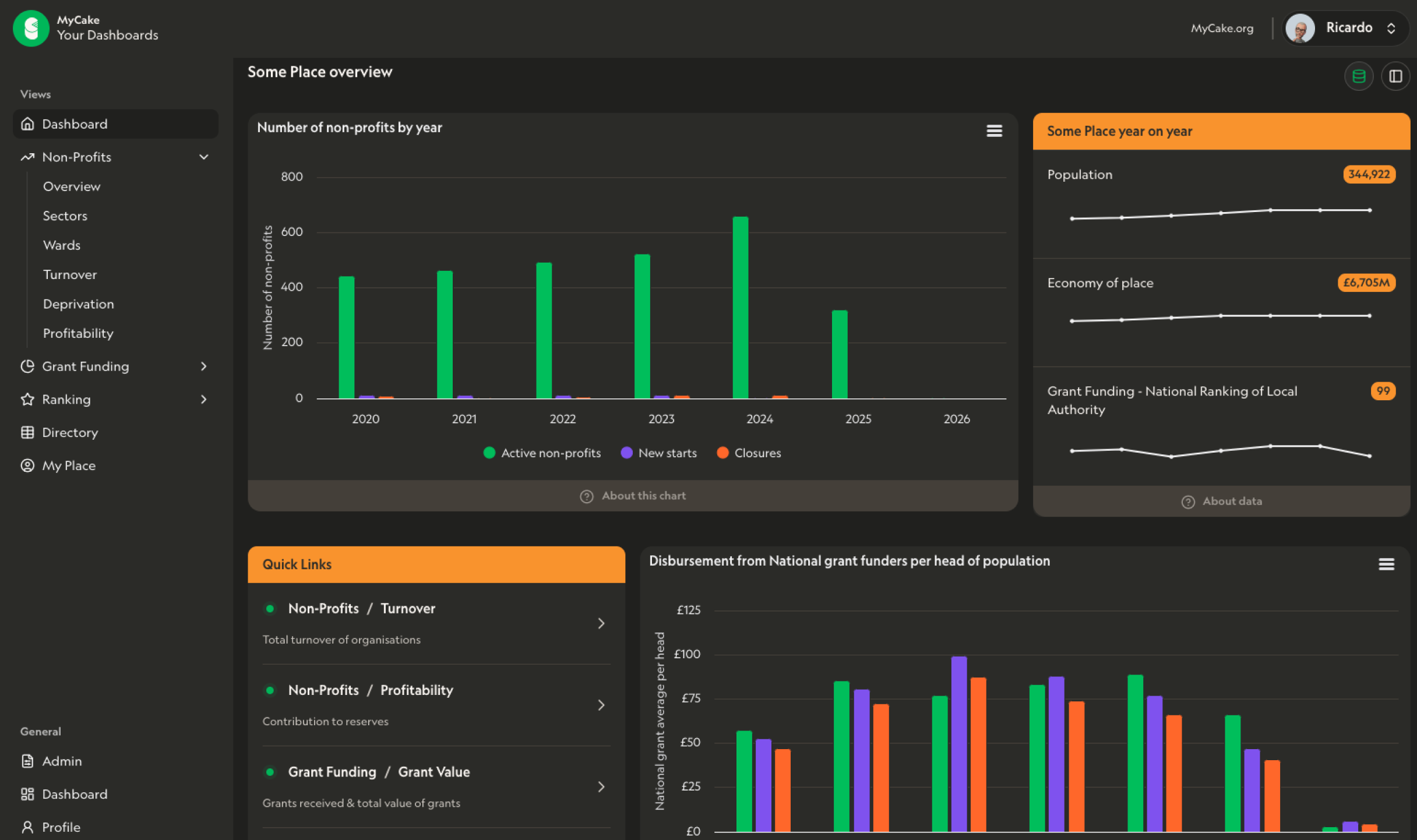
These dashboards enable you to explore the shape and size of the VCSE sector in any given place in the UK. We slice the data by sector, deprivation, turnover, surplus and ward. In addition to exploring all the registered non-profits in your area we also include data on the grants received from public funders such as the Lottery and arms length bodies and private trusts & foundations. These dashboards enable you to answer questions about the size and financial health of the sector in your place and see how this is changing over a five year period.
- By ward —
- how many non-profits are registered in each ward, what is the median turnover of these organisations, what is the total turnover. How does this all stack up into the local VCSE ecosystem?
- By Sector —
- what is the mix of organisations by sector? which sectors are the largest either in terms of the number of organisations or the annual turnover?
- By turnover —
- how many large, medium and small organisations are there in your place? How does their turnover vary by year? What proportion of total turnover comes from small vs. large organisations?
- Directory —
- a downloadable list of all the registered non-profits in your place with data on their sector, turnover, generation of surplus with company and charity number for each.
- Information on non-profits —
- a five year overview of the trends in the sector in your place
- Information on grants —
- a five year picture of the trends in inward investment from grant-making bodies to your place
Frequently asked questions
Can't find the answer you're looking for? Please reach out with any questions.
- Who is this dashboard for?
- If you need a picture of your sector in your place then this dashboard is for you. Our users span across local authorities, central government, individual delivery organisations, umbrella bodies by sector or place, grantmakers and policy makers.
- What geographic areas are available?
- Typically we provide dashboards which cover a single local authority area. We can also provide them for combined authority areas, constituencies and regions. We can cover anywhere in the UK.
- Can I use the data in the dashboard?
- Our goal is to make both the data and the charts as easy to copy and paste as possible. We’d object if you went and resold the data or copied it into another data platform without talking to us about the implications for you and for us but if you want to put it into reports and presentations we are here to help make that easy to do.
- How many members of my team can access the dashboard?
- For now at least we’re not putting a limit on this nor is our pricing on a ‘per seat’ basis. So if you can tell us who needs access we’ll set it up for you. If the list becomes so long that it means we’re dedicating more time to supporting these users than any of us imagined at the start we’ll come back and talk to you about the implications for the price of the services.
- How do I subscribe?
- We build a dashboard for a place when a customer asks for it and agrees the price for an annual licence. Cleaning and tidying the data takes time and effort both to set it up in the first place and to keep it up to date so whether you want it for three months or twelve months the price is the same .. so you might as well have the twelve don’t you think?
- Do you need answers to questions such as:
- Do we see more or less grant funding in our place than the national average? How many organisations are there locally working in health/education/culture/sports (insert your preferred sector here!)? What is the annual value of the non-profit sector in my area? Is there a list of all the non-profits based locally? Which organisations are financially robust vs those which are fragile? Which organisations are likely to be hardest hit financially by e.g. cost of living? These are the sorts of questions the data in these dashboards can help you answer.