Benchmarking dashboard
Nicola Collard
We have created a new benchmarking dashboard for you to try out. You’ll need a password to view it – if you don’t already have one, drop us a line and we’ll give you one.
Reviewing Risk & Resilience by Place – Leicester, an example
To explore the dashboard click on the double-ended arrow on the bottom right hand side of the dashboard. This will enlarge it so you can see it more easily.
There are three separate screens. You can scroll between them using the arrows in the middle at the bottom.
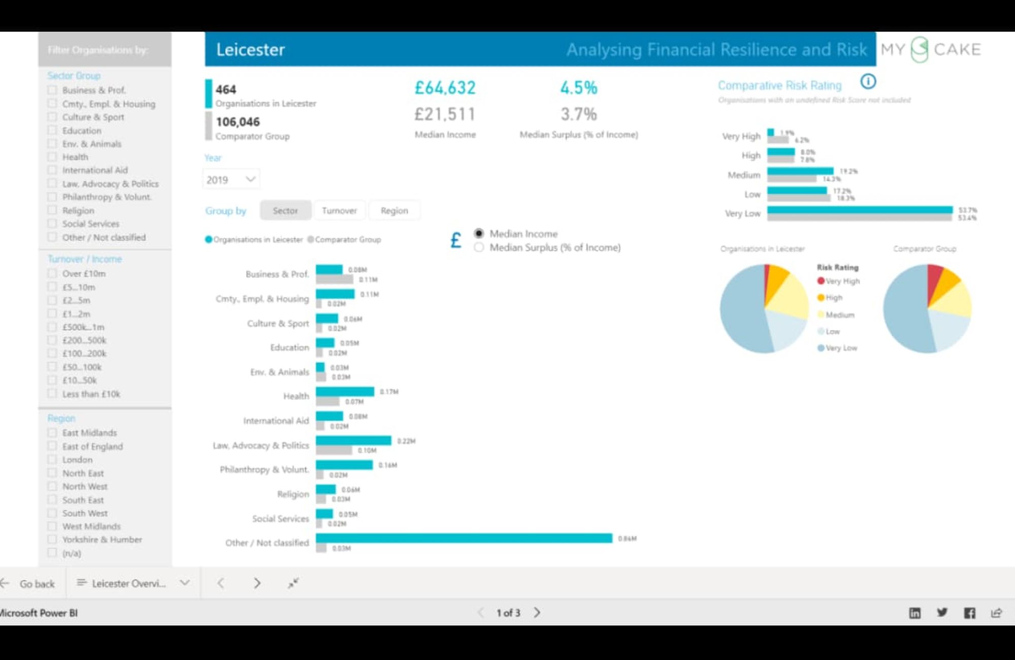
Screen 1
The first screen gives a summary of all the non-profit organisations we have identified in Leicester. There are 464 in 2019. The figures in blue are for Leicester organisations. Those in grey are the benchmark group – in this case about 100,000 organisations across England.
The top of the screen will always show you how many organisations in the selected cohort, their median turnover and the median surplus.
You can focus on specific turnover bands and sectors using the buttons on the left.
You can see data set out in their clusters using the sector, turnover and region buttons in the middle.
On the right hand side you can look at the splits by risk rating.
Screen 2
This takes the data on Leicester organisations and shows it at a ward level in the map.
The list on the right hand side shows you the turnover, surplus and risk rating for each of the organisations in Leicester.
If you hover over a circle on the map it will show you the combined turnover for all the organisations in that ward.
If you click on a circle the list on the right will show only the organisations in that ward.
If you right click on an organisation in the list you can drill down to more information (shown in screen 3) for that single organisation.
Screen 3
Here you can pick any organisation in Leicester or indeed any organisation in the benchmark group.
The bars in the upper left section show you how your chosen organisation compares to the benchmark group (filtered as before with the buttons in the grey section).
The risk rating can now be seen for five years.
The chart on the right shows the five year pattern. If you click on Income or Expenditure or Surplus from the left hand side the content in the chart on the right will change.
What can you use this data to do?
This data perspective enables a review of the social sector ecosystem in a given geographic area. Social sector organisations commonly provide essential health, education, and social care services. This view allows us to look at not only the total reach and coverage of the social sector economy by sector, IMD decile and turnover band. It also enables us to identify the elements of the supply chains where there is greatest risk or resilience.
For example, anecdotal evidence suggests that the adult social care sector is borderline financially unviable. This method helps to identify the least financially resilient organisations, so that a policy decision could be made regarding financial support. Questions such as the balance between grant and loan finance that would be workable in a given scenario could also be addressed. Where debt finance is a workable option, then modelling as to the term and conditions of the loan could also be explored.
Exploration of the data helps to answer the following questions:
- What is the total number of social sector organisations in the area?
- What is the annual turnover of these organisations for each of the last five years?
- What is the churn rate? – volume of new starts and closures
- What is the median contribution to reserves as a percentage of turnover?
- What is the median level of working capital and total net assets (as a percentage of turnover)?
- How many organisations make a loss in a given year and what is the median level of loss?
- How does the data on the above split out by sector of activity, turnover band, IMD decile and year?
- To what extent are social sector organisations winning public sector contracts to deliver services?
- What grant money is coming into the place from Public Bodies (such as Sport England & Arts Council England), the Lottery and private trusts & foundations.
Modelling of the data helps to answer these questions:
- Which organisations in a place show greatest risk/resilience?
- How does this split out by sector, ward, turnover band?
- How has the risk and resilience profile changing over time? – which sectors, turnover bands etc are more at risk now than five years ago?
- What are the patterns in the key contributors to the risk & resilience profiles – turnover, contributions to reserves, salary spend as a proportion of turnover, grant/earned income levels, working capital, debt levels?
- What are the patterns in grant vs. earned income data by sector and how is this contributing to resilient business models?
In turn, we can benchmark one place to others around the country. In Figure 2 we see a selection of social sector organisations based in Leicester with data for 2019. The dashboard shows:
- 464 organisations for which we’ve identified turnover information in 2019. 1.9% in Leicester have a risk rating of ‘very high’ which is lower than the national picture where the figure is 6.2% (Figure 2)
- The median income for these organisations based in Leicester was £64k in 2019 which is higher than the national figure of £22k.